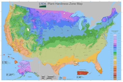
 Photo: USDA
Any time you’re trying to make sure that a plant is going to thrive in a customer’s yard, you look at its sun and water requirements and the hardiness zone, which is generally a good indicator if it is cut out for that climate.
Yet some are beginning to fear that this hardiness zone is a moving target as the boundaries have been shifting northward as certain locations like in Montana have warmed to the point of being classified as a 6a zone.
“For example the peaches – and other fruits, too, like apricots, plums, apples, nectarines, all of which grow in Montana – what you worry about is a warm February or March, which can trigger an early bloom,” Ari LeVaux, a reporter, told Here & Now. “And then suddenly we revert back to normal and have a hard frost and all the flowers die, and the farmer gets an unpaid vacation.”
The U.S. Department of Agriculture (USDA) has been producing plant hardiness zone maps (PHZM) since the 1960s. The zones represent the mean extreme minimum temperature for an area, gathered from the lowest daily minimum temperature for each year from 1976 to 2005.
The maps aren’t designed to represent the coldest an area has ever been or will be, but merely show the average winter temperatures for a certain location for this time period.
The new version of the USDA PHZM shows that most areas are one half-zone warmer than the 1990 version, but this is because previously the USDA relied on readings from the National Weather Service temperature stations. In locations where there weren’t stations, a line was drawn from one data point to the next.
In an attempt to have a finer scale of detail and show smaller areas’ zones, the USDA developed an algorithm that could account for local variables and the map was also fact checked by those on the ground. While this produced a more detailed map, it also prompted a number of people to claim it shows climate change.
However, the USDA’s website explains that climate change is based on overall average temperatures recorded over 50 to 100 years. The PHZM is a map of 30-year average of extreme cold temperatures of the year.
Meanwhile the National Oceanographic and Atmospheric Administration (NOAA) is using its own hardiness zone map to show how the climate has changed over time and is pulling its data from the 1981 to 2010. It also doesn’t change its methodology with every map update.
“[The USDA map] is always the ‘A,’ and ours is a good ‘B+,’” Russell Vose, chief of the Climate Science Branch at NOAA’s National Centers for Environmental Information, told FiveThirtyEight.
So while temperatures may be rising in certain areas, the USDA’s map is going to be more reliable as to what plants can thrive where, while the NOAA map is dedicated to documenting climate change.
