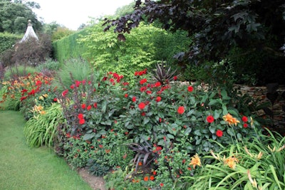
 The red flowers stand out even more against its complementary color green.
Photo: Dave Catchpole/Flickr
Regardless of whether some people choose to acknowledge it, landscaping is an art, and like any good artist, a landscape designer has to make a conscious choice about the color palette.
A client may have a favorite color or prefer that only certain plants be used, but by working with the design principles related to color, these challenges can be easily overcome.
There is a time and place for everything and there is also a space for every color. Every shade evokes various emotions and its appearance can vary depending on location.
Here’s a breakdown of the color wheel and where each hue performs best in the landscape:
Red
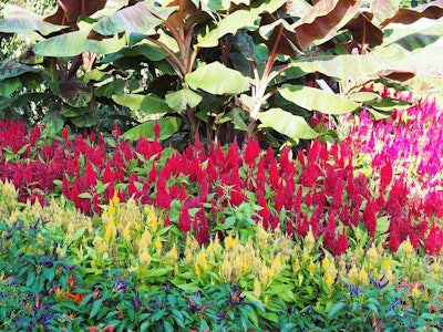 Photo: F.D. Richards/Flickr
Red is the color associated with passion, boldness, drama and energy. It is a warm color, which means it is able to make things appear closer. If a client wants a space to feel smaller rather than more open, a warm color should be used.
Also keep in mind that as a warm color, red will not stand out in shady, dark corners of a space. Red flowers should be used to draw attention to focal points, such as a doorway or a patio for dining. If contrasted with its complementary color green, red can stand out even more.
Red lilies such as “Little Business,” dahlias, petunias, celosia, geraniums, nicotiana and crocosmia are all good choices for red blooms.
Orange
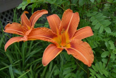 Photo: Pixabay
Orange is brilliant and conveys happiness. It’s also said to stimulate hunger. It is welcoming and creates a friendly atmosphere. This is another color that can be used near the outdoor entertaining area, namely the grill.
It is another warm color so orange should be used to attract attention to areas, just like red. When using a lot of orange flowers, focus on adding different shades and hues so the subtle differences can stand out between the species.
When working in larger spaces with orange flowers, poppies or tulips can work well in filling the space. Chrysanthemums, marigolds, zinnias, tiger lilies and dahlias are all good orange varieties of plants.
Yellow
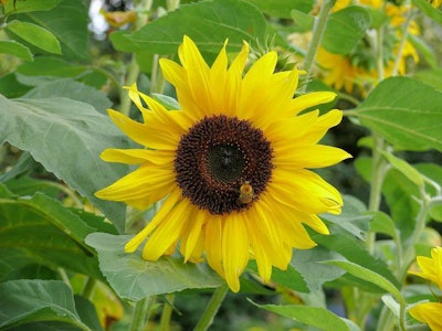 Photo: Pixabay
Yellow is an optimistic color and is often associated with sunshine and happiness. Yet this color must be treated with caution as it can also create anxiety in individuals and become overstimulating if not broken up by other colors.
When working with yellow, select a few bright shades and then pair with softer yellows so the color does not become too vibrant. Use this color when trying to brighten an area or bring some cheer to a gloomy part of the backyard.
Sunflowers, goldenrod, lupines, roses, verbascum, rudbeckia and coreopsis are a few of the many yellow-petal flowers to choose from.
Green
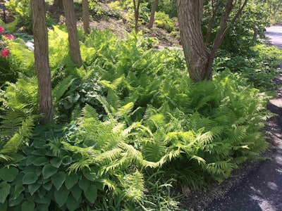 Photo: Jill Odom
Green is a color often taken for granted in the landscape. It is able to invoke the much needed rest and renewal people seek in their backyard escapes. Green is also said to convey reassurance and safety.
Green should be used to create borders or hushed alcoves. Because green is a cool color, it can be used to make a space calm. Cool colors recede in the background and seem farther away. If a cool color scheme is used in small space, it can make the area seem larger. In the shade, cool colors are able to shine brightly.
Foliage comes in copious tints and hues of green. Combining all the variations allows the greenery to stand out as individual plants. Ferns, moss and boxwoods are just the tip of the iceberg when it comes to green plants.
Blue
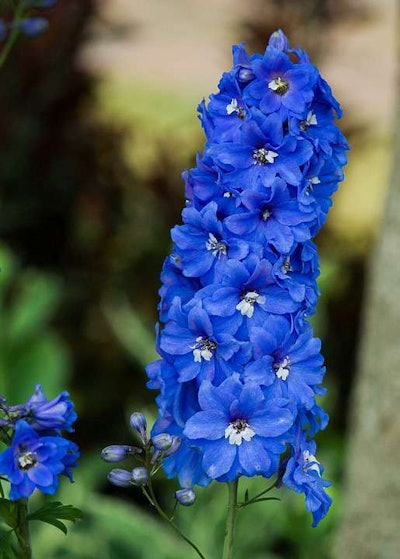 Photo: Pixabay
Another calming, cool color, blue is associated with tranquility, the sea and the sky. Blue can tend to disappear into the background and it is often suggested to add purple or yellow to the mix so the mass planting of blue does not come across as washed out or cold.
Blue can be used to accent other blue objects in the landscape such as a water feature, a path with sea glass, or a blue container.
Flowers that are blue are relatively rare, but there are still some beautiful options, including asters, bellflowers, delphinium, hyacinth, hydrangeas, forget-me-nots and clematis. Other sources of blue can come from foliage and berries, such as the fruit on Arrowwood viburnum “Blue Muffin.”
Purple
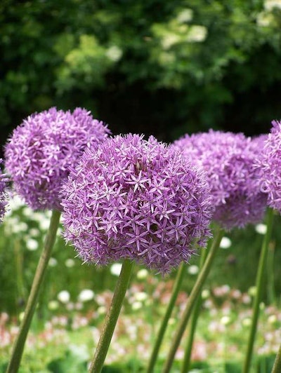 Photo: Pixabay
Purple is associated with the ideas of luxury, royalty and mystery. This color can be either warm or cool depending on which color it is near. If it is near blue, it is perceived as a cool color, while if it is close to red, it is a warm color.
Because of this feature, purple can be either dramatic or subtle in the garden. It’s important to select the right hue of purple, because there are some that are more blue, red or black than traditional purple. If your client wants a calming or romantic space, purple is a good color to add.
German iris, loropetalum, pansies, lavender, alliums and muscari are a sampling of some of the hues of purple that can be used.
White
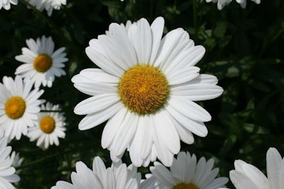 Photo: Mike Pierzynski/Flickr
White is emotionally associated with purity, innocence, and being fresh and clean. It can be counted on to glow early in the morning and late in the evening. Use white in areas that can take advantage of this, such as patios or walkways.
White can help other colors seem brighter. When used by itself, white in the garden can exude class and style. It is important when only using white to isolate it from the rest of the garden.
Hydrangeas, Japanese anemone, lilacs, calla lilies, Shasta daisies, spiraea and astilbe can all work in a white garden. Silvery foliage can be used as well.
Color Schemes
After deciding what color/colors to use in the landscape, the scheme must be selected. Monochromatic color schemes involve only one color, such as the elegant white garden. Sometimes the challenge here can be to avoid going overboard with that one color.
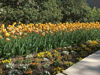 Here is an example of an analogous color scheme with yellow and orange.
Photo: Jill Odom
Analogous color schemes are pairings of colors that are next to each other on the color wheel. Red and orange, orange and yellow, yellow and green, green and blue, blue and violet, violet and red are all analogous pairings. This color scheme tends to blend together at a distance, but it is visually harmonious.
Pairing colors with their color wheel opposite is known as a complementary color scheme. Because the colors are so different from each other, they both make the other stand out more.
In landscapes, one of the colors should be dominant. Purple and yellow, red and green, and blue and orange are all examples of this.
A riotous color scheme uses multiple colors that are vibrant and bold. It is important to use repeating colors in this scheme; otherwise, the space will simply clash without any unity.
Pastel is a subtler, calmer color scheme that uses pastels and silver and gray plants.
Triadic color schemes use the primary colors of red, blue and yellow or the secondary colors of purple, orange and green together.


