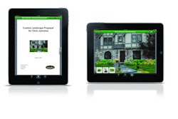


Once a passing consideration, going mobile is now considered imperative for landscape businesses looking to stay abreast of the unbridled popularity of tablets, smartphones and other handheld computerized devices – all of which demand websites designed for small screens.
“We’re moving to a post-PC world,” says Chris Heiler, founder of Landscape Leadership, a green-industry marketing firm. “PC sales are down; tablet sales are through the roof. Everything is moving to the cloud, so we don’t have accessibility issues like we once did. And we’re more mobile as a society, so these devices complement our lifestyles.”
It’s also important to consider the type of browsing done on the devices, adds Garrett Moon, co-owner of Todaymade, a web design firm that does work in the landscape industry. “A large amount of search traffic is taking place on the devices. These days, purchasing decisions are made on mobile devices – that is something that matters to everyone.”
Indeed, according to eMarketer, there will be 54.8 million tablet users in the United States by the close of 2012 and 89.5 million by 2014. All told, 234 million Americans ages 13 and older were using mobile devices in April 2012, and 107 million of those people were using smartphones, according to Comscore.
“Everything in your online marketing should be mobile-friendly,” says Melonie Dodaro, social media specialist, Top Dog Social Media.
Instead of building a mobile-friendly site from the ground up, many landscapers simply opt for mobile site templates, which can be easily customized by adding text and images to pre-configured layouts.
One of the more simple ones to use of this ilk is a template offered by AllWebCo Design. AllWebCo makes templates that can be customized with a text editor like MS Notepad – no web authoring software required. The company’s basic mobile site templates start at about $21; more sophisticated versions run $125 or more.
Similar template providers include Template Monster and Artisteer. Plus, businesses on the WordPress platform can find scores of mobile-friendly, WordPress templates for as little as $8 at template clearinghouse sites like at Themeforest and Codecanyon.
Meanwhile, there are also a number of other useful conversion services on the web, which will convert any traditional site on-the-fly for anyone willing to type in their website address and press enter.
Essentially, these self-service, online providers attempt to grab the essential data, colors and design elements of the site and then re-display it in a mobile-friendly form – usually in a matter of seconds. Subsequently, the landscaper is presented with a number of online tools to use to tweak the resulting design to their taste and preference.
Most of the services also offer free analytics with their packages, so users can track customer activity on the new mobile site. Many offer tools that allow the site’s owner to effortlessly add mobile-specific features, such as click-to-call and mobile-friendly videos.

One of the coolest features of bMobilized is it auto-updates the mobile version of the site any time the user updates the traditional website.
Similar services are offered by Google’s GOMO, which is free for the first year and then $108 yearly. Duda Mobile offers a similar service, which costs $9 monthly for the ad-free version of its service.
Besides deciding on a template or online service provider, one of the key considerations in going mobile is determining if they’ll leave behind their traditional web presence. Many mobile presence providers would have them abandon the traditional site design altogether.
“Let’s keep it simple: Maintain one website with a mobile-responsive design. This is becoming easier with platforms like WordPress and HubSpot offering responsive design,” says Landscape Leadership’s Heiler.
But other web-marketing analysts say landscape businesses may want to stick with a traditional site for people cruising the web on 24-inch or larger screens and then offer a scaled-down, mobile alternative for fans of the tiny screen. These analyst say landscapers should be cautious of the “Responsive Web Design,” which is sold as a one-size-fits-all solution.
In reality, Responsive Web Design actually is a painful compromise – headlines, text and images often look too big when viewed on a desktop screen, these analysts say. Plus, the same content often looks too small (unless users enjoy squinting) on a smartphone. Responsive designs make life easy for web designers – but often at the expense of everyone else.
Essentially, before signing off on a responsive web design site, business owners should ask to see a number of sample ‘responsive” pages loaded with headlines, text and images, and view those pages on a desktop, tablet and smartphone. If they’re happy with the results on each, they should go for it. If they feel the one-size-fits-all approach really means disappointment-for-all, they should consider offering two sites – one for desktop, another for mobile.
By Joe Dysart