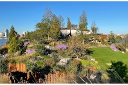


Color can be such a critical part of landscape design. It's often the colors that provide the "wow factor" that people desire. But color choices aren't always as simple as they seem.
Todd Thomasson, owner of Rock Water Farm Landscapes & Hardscapes in Aldie, Virginia says the proper use of color in a landscape can have a significant impact on the design. Here are a few considerations he suggests keeping in mind.
Considering color relationships
 Rock Water Farm
In color theory, an important consideration is color relationships. This is simply the way in which colors "go together," explains Thomasson. The two types of color relationships are complementary colors (colors that are opposite one another on the color wheel) and analogous colors (those that are next to each other).
As the name implies, complementary colors complement one another (or "bring out the best" in each other). Yellow and purple, red and green, or orange and blue are all examples. These combinations tend to be bold. You'll often see professional sports teams use complementary colors for uniforms for this very reason.
Analogous colors, on the other hand, look similar to each other. Examples are yellow, yellow-green, and green; Red, red-orange, orange; and Blue, blue-violet, purple.
Using analogous colors in your landscape design is more subtle. If you have a large area with a lot of flowers, analogous colors would appear as though they slowly transition from one color to another.
There is no right or wrong choice here, it's all about what the client wants and what works best for the space, Thomasson says.
Considering color harmony
 Rock Water Farm
Another consideration is "color harmony." In color theory, color harmony is simply the idea that colors should be arranged in a way that is pleasing to the eye. This obviously relates back to your choice of color relationships.
In landscape design, it might mean avoiding extreme variations in color. Thomasson says choosing "one of each" with a whole bunch of different colors might look "messy" or "busy" to the eye. Typically, you do want to use some block grouping of colors to achieve the desired effect.
Making the best color choices
As far as making the best color choices, there is definitely a lot of personal preference that goes into that decision, says Thomasson. Some of your clients may have very specific reasons why they prefer certain colors.
Colors tend to evoke feelings. For instance, strong colors like red and yellow are said to make people feel energized whereas muted shades like pink and white can feel more subdued.
Much of this boils down to the look you're trying to achieve and what your client prefers.
Of course, you'll also want to look at the surrounding colors of the landscape itself. Colorful flowers often pop best with background foundational plantings. Also, pay attention to any structures in the background of your plantings and how they might affect your color scheme.
At the end of the day, making wise color choices will help your clients appreciate their landscapes to the fullest. You can help guide your clients through the process with suggestions they might not have considered.